Showing posts with label layers. Show all posts

Thursday, September 2, 2010

42 below - bottle

ok so below is my final edit of the 42 below - bottle only.
I included and "morphed" 2 bottles together, the first being the silhouetted bottle, and the 2nd being the label. Below is the Layer by layer process of my final photograph.
I have also cleaned up the bottle, as seen in 1st and 2nd image. on the bottle has engraved information on the back of the bottle, but as it is clear it is still very visible from the front, so i have edited it out. it looks so much more effective without the busy images coming from behind.
The Label took a lot of work as i had to overlay the correct exposure onto the silhouettedbottle. A lot of time was spent on the bottom labels as i had to erase all in between the lettering.
Im still not entirely happy with the bottom labels, potential more editing to come.


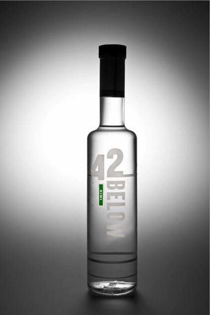
KIWI FRUIT BEING EDITED IN NOW ! :)
So this is something which i have put together......

Anjeo Patron

So this is a work in progress collaboratively putting together 3-4 photographs, just for the bottle.
That doesn't include the extra elements going into the advertisement, which will be (not edited yet), honey dripping from honey sticks, honeycomb and shot glass on ice.
Looking through my boyfriend's ESPN magazines from the States, they do a lot of alcohol advertisement, and i feel that my final product would be perfect for their magazine.
So below are some screen shots of "the bottle", layer after layer.

This photograph is what i started with, So i used the cork from this shot.
This shot i used a silhouetted photo of the bottle, using the layer above, for the cork
This image is from a 3rd photograph and i used the label.
the fourth layer is for the lettering on the bottle, from yet another photograph.


Monday, August 23, 2010

42 Below

42 Below is a top shelf Vodka from New Zealand.
I chose the Kiwi flavour as i can create a composite image including kiwi fruit sliced up and using flash equipment and a fish tank (or similar) to create an advertising image.
So i needed to start with a base image. This is the bottle. I started off with a vague idea of what lighting i wanted, which didn't end up so great. Then with the help from Geoff i created something 10x better.
Using 3x P70's with 2x large grids, and 1x medium grid and using the "S" table, created a beautiful silhouette. Then I added a snoot from a distance to capture the label and more highlighted areas on the front.
From what Geoff was telling me, i found it extremely hard to photograph a clear bottle from both the back (to achieve a 'glowing' effect), and to also light it from the front (to get the label). So suggesting instead to light the bottle, then light the label separately and merge them together. However from looking at the computer i found i much enjoy the more silhouetted look, but this won't work very well with what i have in mind to create the composite image.


Thursday, August 19, 2010

retouching 1

This is for Imaging class with Kate Luke.
This image is my head shot image using appropriate photo-retouching. I thought because this image was a very clean, nice portrait i decided not to take the editing to "full" lengths as it would over-do the photo.
I started off with the Raw image:


Then did some minor production in Lightroom:


Following i retouched this photograph in CS5.
Exported file from Lightroom:


The first layer to edit on is the hair.
I cloned the hair from other spots and blended it in to match original hair (this is mainly visible in the fringe). Using the Dodge tool, i created nice highlights in the hair, and the Burn tool to use on the darker parts of her hair.
This layer also included minor skin adjustments, moles and blemishes using the Clone tool, and also the Dodge tool.


The 2nd layer I focused more on the skin:
This is where i "blurred" the skin on a low strength. I also used the Dodging tool and Patch tool to smooth out more areas in the skin.


The 3rd layer I focused on the eyes, wrinkles:
Using the Patch tool this removed wrinkles but remained detail and texture.


The 4th and final layer is where i played more around with "typical aesthetics", removing weight of her face and making it a bit more "magazine-looking".
This was done using the Liquify tool. Using this function can be over-used and it can also remove a lot of detail within a photograph if used too much as it is be compressed away. Also I added more texture to the left of her face using the Burn tool.